You can customise icons to better apply particular policies. For example, a popular strategy is to colour a range of services in a similar way:
Colour categories
Because configuration is quick and easy, you can also change the colour of many default graphics "on the fly". This enables you to assign meaning to colour variations of each graphic.
Services without assigned graphics
![]() Services that do not have a default graphic (or user selected one) appear as a grey icon with a question mark. You can customise these by both graphic and colour.
Services that do not have a default graphic (or user selected one) appear as a grey icon with a question mark. You can customise these by both graphic and colour.
Customisation limitations:
All the services with a chart graphic type have a fixed menu graphic that cannot be edited except with the colour setting.
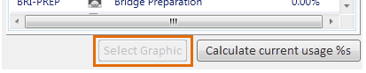
Fillings have a standard MO shape, with the graphic scaled to fit the line height. The icon cannot be customised, and the Select Graphic button is greyed out. For example, :